 LiveChat
  Support
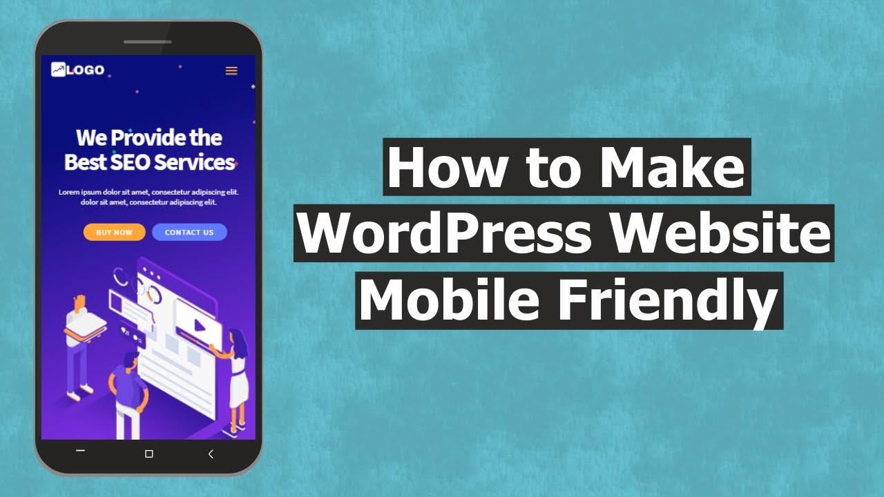
How to Build a WordPress Site That is Mobile-Friendly
Have you ever browsed a website on your phone, only to be frustrated by how hard it is to read or navigate? You’re not alone! In today’s world, where everyone seems glued to their smartphones, having a mobile-friendly website is more crucial than ever. It’s not just about looking good; it’s about making sure your audience can easily access information, shop, or connect with you without squinting or pinching their screens.
Building a WordPress site that’s mobile-friendly often seems overwhelming. Maybe you’ve tried, but the results were less than satisfactory. Or perhaps you’re unsure where to begin. Don’t worry! We understand the challenges you face when creating a site that meets both your needs and those of your visitors. This guide is here to provide you with practical, step-by-step advice to make your WordPress site easy to use on mobile devices. Are you ready to get started?
Let’s dive into some essential tips that can help transform your WordPress website into a mobile-friendly powerhouse!
Understand the Importance of Mobile-Friendliness
First off, let’s talk about why making your website mobile-friendly matters. Imagine you’re hosting a dinner party. You wouldn’t want your guests to struggle with a cramped dining area or outdated seating, right? Similarly, your mobile site should provide a comfortable browsing experience for your audiences.
Statistics show that over half of all web traffic comes from mobile devices. If your site isn’t optimized for mobile, you might miss out on this substantial audience. Not only that, but Google also prioritizes mobile-friendly sites in its search results. This means a responsive design can boost your search engine ranking, driving more traffic to your site! Isn’t that a compelling reason to pay attention to your site’s mobile version?
Choose a Responsive Theme
Your theme can make or break your site’s mobile experience. Opting for a responsive theme is crucial, as these automatically adjust to different screen sizes. Think of it like a chameleon that changes its colors based on its environment.
- Check Theme Compatibility: Before settling on a theme, ensure it’s compatible with mobile devices. Most WordPress themes come with a mobile-friendly option, but it’s good to double-check.
- Read Reviews: Customer reviews can offer insights into how a theme performs on mobile.
- Explore Theme Demos: Many themes have live demos. Check these on your mobile device to see how they look.
Utilize Mobile Plugins
WordPress offers various plugins designed to improve mobile responsiveness. Think of plugins as the handy tools in your toolbox that make your building process smoother.
- WPtouch: This plugin creates a simple mobile version of your site, giving users a streamlined experience.
- Jetpack: Among many features, Jetpack optimizes images and includes CSS for mobile traffic.
- Responsive Menu: This plugin allows you to customize the mobile menu, making navigation a breeze for users on smaller screens.
Optimize Your Images
Images can significantly affect your site’s loading speed, especially on mobile. A slow loading website can be just as frustrating as a poor user interface. Let’s think of images like a heavy backpack on a hike; if it’s too heavy, you might find it challenging to keep going.
Follow these tips to optimize your images:
- Use Appropriate Formats: Use JPEG for photos and PNG for images with transparent backgrounds.
- Compress Images: Tools like TinyPNG or Smush can reduce image file sizes without compromising quality.
- Specify Image Dimensions: Always define width and height in your HTML to prevent layout shifts.
Ensure Fast Loading Times
Nobody likes a slow website, especially on mobile. In an age where information is at our fingertips, delays can mean losing potential visitors. Optimizing your site for faster loading times is akin to making sure your lunch break is sufficient—nobody wants to waste precious time waiting!
Here are some ways to enhance your site’s speed:
- Use Caching Plugins: Implement plugins like W3 Total Cache or WP Super Cache to speed up loading.
- Minimize HTTP Requests: Reduce the number of elements on your page to decrease loading requests.
- Choose a Reliable Hosting Provider: Consider using a service like DarazHost for superior performance and support.
Implement Easy Navigation
Mobile users often navigate using their fingers, which means simple navigation is essential. Imagine trying to drive a car filled with roadblocks when all you want is to reach your destination—it can be frustrating! Your site should allow easy access to various sections without hurdles.
Here’s how to implement easier navigation:
- Use a Simple Menu: Keep your menu clean and straightforward, allowing users to find what they need easily.
- Utilize Sticky Navigation: A sticky menu stays fixed, so visitors don’t have to scroll back to access different pages.
- Include a Search Bar: This feature gives users an alternative way to find content quickly.
Test Your Site on Multiple Devices
Testing your site is like taking a dress for a spin before the big event. While it may look great on a hanger, it could fall short when worn. Ensure that your WordPress site performs well across various devices!
Tools like Google’s Mobile-Friendly Test allow you to check how your website performs on mobile. Spend some time on different devices and browsers to get a comprehensive view of the user experience.
Keep Your Content Short and Sweet
Users don’t like to read lengthy paragraphs on their phones. Think of your content like a good Instagram caption; it should be engaging yet informative. Conciseness is key!
To keep your writing effective for mobile:
- Use Short Paragraphs: Break your text into small, digestible chunks for better readability.
- Use Bullet Points: These can help highlight important information quickly.
- Incorporate Visuals: Images and videos can break up text and retain visitor attention.
FAQs
What makes a WordPress site mobile-friendly?
A mobile-friendly WordPress site uses a responsive theme, compresses images, optimizes loading times, and ensures ease of navigation on mobile devices.
How can I test if my site is mobile-friendly?
You can use Google’s Mobile-Friendly Test tool, which helps identify any mobile usability issues on your site.
Which plugins should I use for mobile optimization?
Plugins like WPtouch, Jetpack, and Responsive Menu are great for improving mobile optimization on your WordPress site.
Can I manually modify my existing theme for mobile?
Yes, you can manually add responsive CSS and media queries to your existing theme, but it’s often simpler to use a mobile-responsive theme.
What is a responsive theme?
A responsive theme automatically adjusts its layout based on the size of the device’s screen, ensuring a consistent browsing experience across all devices.
Why does site speed matter for mobile users?
Site speed is crucial for mobile users because they often browse on the go and expect fast, efficient access to information. A slow website can lead to increased bounce rates, as users are less willing to wait for pages to load. Furthermore, search engines like Google take site speed into account when ranking pages, which means a slower site can negatively impact your visibility and traffic.
Final Thoughts
Making your WordPress site mobile-friendly is not just a trend; it’s a necessity. As mobile traffic continues to dominate, ensuring that your website provides a seamless experience for mobile users will keep your audience engaged and satisfied. By following the tips outlined in this guide, you can create a site that not only looks great on mobile devices but also functions effectively.
Remember, a mobile-friendly site is not just a nice-to-have—it’s essential for reaching your audience, improving SEO, and ultimately achieving your business goals. So, roll up your sleeves, dive into these strategies, and watch your mobile traffic soar!
About the Author
 Admin
Admin
DarazHost has been providing quality Web Hosting services since 2014. Our Goal at DarazHost is to provide high quality managed web hosting services at the lowest possible rate and the highest customer satisfaction. We focus mainly on up-time and client satisfaction, with the fastest servers on the market and an equally fast support team, our performance is second to none. A unique aspect of our company can be seen in the high level of support that is guaranteed with all the plans we have available.
