LiveChat
  Support
eCommerce Navigation Best Practices: Designing Stores Shoppers Can Actually Use
Navigation is the connective tissue of an online store. It is the system that takes a shopper from “I’m curious” to “I found exactly what I wanted” to “I’m checking out.” When navigation is clear and fast, browsing feels effortless and product discovery happens almost subconsciously. When it is confusing, cluttered, or slow, shoppers bounce, and every dollar you spent acquiring that visitor is lost at the doorway.
This guide covers eCommerce navigation best practices end to end: how to structure categories, when to use mega menus, how to make search work for you, how faceted filtering and breadcrumbs reduce friction, and how mobile navigation differs from desktop. The throughline is simple: good navigation is not decoration. It is a conversion engine.
Key Takeaways
• Logical category hierarchy is the backbone of discovery. Limit top-level choices and use descriptive, not clever, labels.
• On-site search converts at higher intent than browsing. Make search prominent, smart, and forgiving of typos.
• Faceted filtering and sorting let shoppers narrow large catalogs quickly. Breadcrumbs keep them oriented.
• Mobile navigation must be simplified, thumb-friendly, and persistent. Keep the cart always reachable.
• Performance is non-negotiable. Slow menus, search, and filters destroy otherwise excellent navigation design.
Why does navigation matter so much for conversions?
Every interaction a shopper has with your store passes through navigation. A visitor who cannot find a product cannot buy it, no matter how good the price or how compelling the product page. Navigation directly shapes three things that drive revenue: discoverability (can shoppers find products?), orientation (do they know where they are?), and momentum (does the path to checkout feel smooth?).
Poor navigation creates decision paralysis and friction. Shoppers abandon carts not only because of price or shipping, but because the journey to that cart was confusing. Good navigation, by contrast, reduces the cognitive load of shopping, builds trust, and shortens the clicks to product. Fewer clicks, clearer paths, and faster responses all compound into higher conversion rates.
How should you structure category hierarchy?
A strong information architecture starts with a logical, intuitive category structure. Group products the way your customers think about them, not the way your internal teams or warehouse are organized. Shoppers look for “men’s running shoes,” not “SKU group 4471.”
Follow these principles:
- Limit top-level choices. A small number of clear top-level categories beats a sprawling list. Too many options trigger choice overload and make the menu harder to scan.
- Build a logical hierarchy. Move from broad to specific: Category to Subcategory to Product. Keep depth shallow enough that nothing important is buried three or four levels down.
- Use descriptive labels, not clever ones. “Outerwear” or “Jackets & Coats” beats a branded buzzword no one searches for. Navigation is not the place for wordplay.
- Be consistent. Use the same naming patterns across the menu, breadcrumbs, and page titles so shoppers build a reliable mental model.
When do mega menus help?
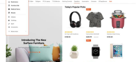
For stores with large catalogs and many categories, a mega menu can expose a wide range of options without forcing endless clicking. A well-built mega menu reveals subcategories, featured collections, and sometimes imagery in a single, organized panel.
Mega menus work best when they are grouped and scannable with clear column headings. They fail when they become a wall of undifferentiated links. If your catalog is small, a simple dropdown or even a flat menu is friendlier than an oversized panel. Match the navigation pattern to the size and complexity of your inventory.
Why is on-site search a conversion goldmine?
Here is the insight many stores underestimate: shoppers who use on-site search convert at significantly higher intent than shoppers who only browse. A person who types “wireless noise-cancelling headphones black” is not window-shopping. They know what they want and they are ready to buy. They have effectively raised their hand and told you their purchase intent in their own words.
That makes the search box one of the highest-leverage elements in your entire store. Treat it accordingly:
- Make search prominent. Put a visible, always-available search bar near the top of every page. Hiding search behind an icon penalizes your most motivated shoppers.
- Add autocomplete and suggestions. Surface products, categories, and popular queries as the shopper types. This shortens the path and previews that you carry what they want.
- Build in typo tolerance. “Headphnoes” should still return headphones. Forgiving search prevents dead ends caused by simple misspellings.
- Return good, relevant results. Nothing kills trust faster than a confident searcher hitting a “no results found” page for a product you actually sell.
- Let searchers filter and sort results. Apply the same faceted controls to search results that you use in category pages.
When you make search prominent and smart, you are pointing your sharpest tools at your most ready-to-buy customers. Few navigation investments pay back faster.
How do filtering and sorting reduce friction?
Once a shopper lands in a category or a search result with dozens or hundreds of items, they need to narrow quickly. Faceted filtering lets them refine by attributes that matter to them: size, color, price range, brand, rating, availability. Sorting lets them reorder results by price, popularity, or newness.
Good faceted navigation:
- Shows how many results match each filter so shoppers avoid empty combinations.
- Lets shoppers apply multiple filters and see the active filters clearly.
- Makes it easy to remove a filter or reset entirely.
- Updates results instantly, ideally without a jarring full-page reload.
Filtering turns an overwhelming catalog into a manageable shortlist. It is one of the most direct ways to reduce the clicks and scrolling between a shopper and the product they will buy.
How do breadcrumbs keep shoppers oriented?
Breadcrumbs are the small trail near the top of a page (Home > Category > Subcategory > Product) that tells shoppers where they are and how they got there. They serve two jobs: orientation, so shoppers never feel lost, and easy backtracking, so they can jump up a level without hitting the browser back button repeatedly. Breadcrumbs also reinforce your category structure and provide useful internal links for both users and search engines.
What is the navigation elements cheat sheet?
| Navigation Element | Purpose | Best Practice |
|---|---|---|
| Primary nav / categories | Top-level product discovery | Limit top-level items; descriptive labels; logical hierarchy |
| Mega menu | Expose large catalogs | Group into scannable columns; use only when catalog warrants it |
| Search bar | Serve high-intent shoppers | Prominent placement; autocomplete; typo tolerance; relevant results |
| Faceted filters | Narrow large result sets | Show result counts; multi-select; instant updates; easy reset |
| Sorting | Reorder by preference | Offer price, popularity, newest; remember selections where sensible |
| Breadcrumbs | Orientation & backtracking | Reflect true hierarchy; keep clickable |
| Sticky / persistent nav | Constant access | Keep nav and cart reachable as the shopper scrolls |
| Cart access | Path to checkout | Always visible; show item count; quick view of contents |
| Mobile nav (hamburger / bottom bar) | Small-screen discovery | Simplify; thumb-friendly; prioritize key actions |
| Footer navigation | Secondary links | Policies, support, account, and lower-priority categories |
How should mobile navigation differ?
Most stores now see the majority of traffic on phones, so mobile navigation is not an afterthought. The constraints are real: less screen space, touch instead of a mouse, and shoppers often on the move. Design for those constraints directly.
- Simplify ruthlessly. Collapse the menu into a hamburger or use a bottom navigation bar for the most important actions, like home, search, categories, and cart.
- Design for thumbs. Put primary actions within easy thumb reach and make tap targets large enough to hit reliably.
- Keep search and cart persistent. A shopper should be able to search or check their cart from anywhere without hunting.
- Avoid deep nesting. Each extra tap on mobile costs more patience than on desktop. Flatten where you can.
A clean mobile experience is often the single biggest lever for conversion improvement, simply because that is where most of the buying happens.
How does sticky navigation and a persistent cart help?
Sticky or persistent navigation keeps the menu, search, and cart accessible as a shopper scrolls a long product page or category listing. This matters because momentum is fragile: if a shopper has to scroll all the way back up to search again or check their cart, you introduce friction at exactly the wrong moment.
A persistent, always-visible cart with a live item count reassures shoppers, makes adding items satisfying, and keeps the path to checkout one tap away. Reducing the distance between “I want this” and “I’m buying this” is the whole game.
What about footer navigation and accessibility?
Footer navigation is the home for secondary but important links: shipping and returns policies, customer support, account access, company information, and lower-priority categories. Shoppers instinctively scroll to the footer for trust and support information, so keep it organized and complete without overloading it.
Accessibility is both a responsibility and a business advantage. Navigation should be operable with a keyboard, work with screen readers, use sufficient color contrast, and provide clear focus states. Accessible navigation widens your audience, and the same clarity that helps assistive-technology users tends to make navigation better for everyone.
How do you minimize clicks to product and smooth the path to checkout?
Every click is a chance for a shopper to hesitate or leave. The goal is to reduce the clicks to product and keep the route to checkout obvious and short. Audit your store by asking: how many clicks does it take to go from the homepage to a finished purchase? Then look for steps you can remove or shortcut.
Practical tactics:
- Surface popular categories and products directly from the homepage and search.
- Let shoppers add to cart from listing pages where appropriate.
- Keep the cart and checkout entry visible at all times.
- Remove unnecessary interstitial pages between the cart and checkout.
DarazHost: fast hosting that makes good navigation feel good
You can design flawless navigation, but if your store is slow, none of it lands. When a shopper applies three filters and waits, or types into search and the autocomplete stalls, the experience falls apart no matter how thoughtful the design. Slow filtering and sluggish search quietly kill conversions. Performance is what turns good navigation design into a good navigation experience.
That is exactly what DarazHost eCommerce hosting is built for. Our SSD-powered infrastructure and intelligent caching keep menus, search, autocomplete, and faceted filtering responding instantly, so shoppers never wait between “I want this” and “show me.” Every store includes a free SSL certificate to keep checkout secure and trusted, plus 24/7 expert support to keep your storefront fast and online around the clock.
Great navigation deserves infrastructure that can keep up with it. gives your design the speed it needs to convert.
Frequently Asked Questions
What is the most important element of eCommerce navigation? There is no single element, but on-site search is among the highest-leverage because searchers signal strong purchase intent. A prominent, smart, typo-tolerant search bar serves your most ready-to-buy shoppers. Paired with a logical category hierarchy, it covers both browsers and searchers.
How many top-level menu items should an online store have? Fewer is generally better. Limit top-level choices to a tight set of clear categories so the menu stays scannable and shoppers avoid choice overload. Push depth and breadth into subcategories, mega menus, and filtering rather than crowding the primary navigation.
Should I use a mega menu? Use a mega menu when you have a large catalog with many categories that benefit from being exposed at once. Keep it grouped into scannable columns. For smaller catalogs, a simple dropdown or flat menu is clearer and less overwhelming.
Why does navigation speed matter for conversions? Because navigation involves constant interaction: opening menus, searching, and applying filters. If any of those lag, shoppers lose momentum and patience. Fast, responsive navigation keeps the buying flow smooth, which is why hosting performance, SSD storage, and caching directly affect conversion rates.
How is mobile navigation different from desktop? Mobile navigation must be simplified and thumb-friendly. Use a hamburger menu or bottom navigation bar, keep search and cart persistent, enlarge tap targets, and avoid deep nesting. Since most traffic and many purchases happen on phones, mobile navigation often has the biggest impact on conversions.