LiveChat
  Support
Should Your Website’s Mobile Menu Just Have ‘Shop’? A Strategic Guide
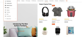
When the majority of your store’s traffic arrives on a phone, the mobile menu stops being a navigation afterthought and becomes one of the most consequential design decisions you make. A common instinct among store owners chasing simplicity is to strip the mobile menu down to a single action: Shop. The logic feels sound — fewer choices, less clutter, a clearer path to products. But a menu that *only* says “Shop” is too blunt an instrument. The better answer is prioritization, not elimination: surface the actions mobile shoppers actually need — shop, search, cart, and account — and tuck everything else behind progressive disclosure.
This guide explains how to think about mobile navigation strategically, compares the dominant menu patterns, and shows where simplicity helps and where it quietly costs you sales.
Key Takeaways
• A mobile menu should not contain only “Shop.” Doing so hides the high-intent actions (search and cart) that drive purchases.
• Prioritize the core ecommerce quartet: shop/browse, search, cart, and account. Demote secondary links (About, Policies, Blog) behind a hamburger or footer.
• A persistent bottom tab bar often outperforms a hamburger-only menu for shopping tasks because key actions stay one tap away.
• Use progressive disclosure to keep the first layer minimal while remaining navigation stays accessible.
• Every navigation decision should be tested, not assumed — and supported by fast hosting so menus and pages load before shoppers lose patience.
Why Does Mobile Navigation Deserve Special Strategy?
Desktop navigation has room to breathe. A horizontal menu bar can hold a dozen categories with hover-activated dropdowns, and there is space for both primary and secondary links. The phone offers none of that latitude. You are working with a narrow viewport, thumb-driven interaction, and shoppers who are frequently distracted, in transit, or browsing in short bursts.
That constraint forces a hierarchy of intent. Most mobile shoppers want to do one of a few things: find a product, browse a category, check their cart, or manage their account. Everything else — your return policy, your brand story, your careers page — matters, but rarely in the first three taps. Good mobile navigation respects that hierarchy by making the high-intent actions immediate and the low-intent ones merely *reachable*.
This is where the “just have Shop” idea both succeeds and fails. It succeeds at reducing visual noise. It fails because “Shop” is only one of several high-intent actions, and collapsing everything into it forces shoppers to dig for search and cart — the very tools that convert browsing into buying.
Should the Mobile Menu Only Contain “Shop”?
No. A single “Shop” entry treats navigation as a one-dimensional funnel when real shopping behavior is multi-threaded. Consider what you lose by hiding everything else:
- Search is the fastest path to purchase for shoppers who already know what they want. Burying it inside a “Shop” submenu adds friction precisely where intent is highest.
- Cart access needs to be persistent. A shopper adding items across several pages must be able to glance at and reach their cart without hunting for it.
- Account / sign-in matters for returning customers, order tracking, and saved carts. Hiding it can stall repeat purchases.
The stronger framing is not “should the menu be minimal?” but “which actions deserve to be one tap away?” For most ecommerce stores, that shortlist is shop (or browse categories), search, cart, and account. These four can live in a persistent, always-visible layer. Secondary links — policies, support, blog, company info — belong one layer deeper.
So the menu should feel minimal, but minimalism is achieved by *demotion*, not deletion. You are not removing navigation; you are ranking it.
A useful mental model: treat your mobile navigation like a retail store layout, not a table of contents. A physical store does not greet you with a directory of every department in equal weight. It puts the entrance, the search-equivalent (signage and staff), the checkout, and the most-shopped aisles where your hands and eyes naturally fall — and it tucks the loading dock, the office, and the policy notices out of the primary flow. Your mobile menu should make the same spatial choices: the actions that move a shopper toward checkout get prime real estate; the institutional content gets a quieter corner.
What Are the Main Mobile Menu Approaches?
Several patterns dominate ecommerce mobile design, each with trade-offs. The right choice depends on your catalog size, how shoppers browse, and where your conversions stall.
| Approach | How It Works | Pros for Ecommerce | Cons for Ecommerce |
|---|---|---|---|
| Hamburger menu | A single icon expands a full off-canvas menu | Saves space; holds a large category tree; familiar pattern | Hides everything behind one tap; low discoverability; key actions get buried |
| Bottom tab bar | A fixed bar with 4–5 core actions (shop, search, cart, account, home) | Persistent, thumb-friendly, one-tap access to high-intent actions | Limited slots; not native to the web (needs deliberate design); can crowd small screens |
| Priority+ pattern | Shows top-priority items inline, collapses the rest into a “More” menu | Surfaces your best-converting categories; adapts to screen width | Requires knowing your priorities; “More” can become a junk drawer |
| Tab bar (top, horizontal scroll) | Scrollable row of category tabs near the top | Good for stores browsed by category; keeps catalog visible | Off-screen tabs are easy to miss; less suited to action items like cart |
In practice, the most effective ecommerce mobile experiences combine these. A persistent bottom tab bar carries the core quartet (shop, search, cart, account), while a hamburger holds the deep category tree and institutional links. The tab bar handles intent; the hamburger handles completeness. This pairing delivers the “minimal” feel store owners want without sacrificing the actions that drive revenue.
How Does Progressive Disclosure Keep Menus Both Minimal and Complete?
Progressive disclosure is the principle of showing only what is needed at each step and revealing more on demand. It is how you reconcile the tension between “keep it simple” and “don’t hide what shoppers need.”
Applied to mobile navigation, it looks like this:
- Layer one — the always-visible core actions (bottom tab bar): shop, search, cart, account.
- Layer two — top-level categories and key landing pages, revealed when a shopper taps “Shop” or the hamburger.
- Layer three — subcategories, filters, and secondary content, revealed only after a category is chosen.
Each layer stays uncluttered while the full structure remains reachable. The shopper never sees the whole tree at once, but they are never more than a tap or two from any destination. This is the disciplined version of “minimal” — minimal at every step, complete in aggregate.
How Do You Reduce Friction to Purchase Through Navigation?
Navigation is friction management. Every unnecessary tap, every moment of hesitation, every “where is the cart?” is a small leak in your funnel. To plug those leaks:
- Make search prominent, not hidden. A visible search field or a dedicated search tab respects high-intent shoppers.
- Keep the cart persistent and badged. A cart icon with an item-count badge reassures shoppers and invites checkout.
- Use clear, conventional labels. “Shop,” “Search,” “Cart,” “Account” beat clever alternatives. Mobile is not the place for novelty.
- Minimize taps to checkout. Audit the path from product page to confirmed order and remove every avoidable step.
- Respect the thumb zone. Place core actions within easy reach of a thumb — the lower portion of the screen — rather than the hard-to-reach top corners.
Crucially, none of this matters if the menu is slow to respond. A tap that produces a half-second of nothing reads as a broken interface, and mobile shoppers abandon sites that feel sluggish. Navigation speed is part of navigation design.
Why Does Hosting Performance Shape Mobile Navigation?
It is tempting to treat menu design and infrastructure as separate concerns. They are not. A beautifully prioritized bottom tab bar still fails if tapping “Shop” stalls while a slow server assembles the category page. Mobile shoppers are impatient by nature — they are often on cellular connections, multitasking, and quick to bounce. Every fraction of a second your store spends loading is a fraction in which a shopper can reconsider.
This is the point where navigation strategy meets ecommerce hosting.
Build your mobile store on hosting that keeps pace with shoppers. DarazHost provides fast ecommerce hosting engineered for the realities of mobile commerce. Our stack pairs SSD storage, server-side and page caching, and a global CDN so that menus respond instantly and category pages render before impatient shoppers lose interest. Because mobile users abandon slow sites, shaving load time directly protects conversions. Every plan includes free SSL, so checkout carries the trust signals shoppers look for before entering payment details — essential when so much purchasing now happens on a phone. Whether you run a lean storefront or a deep catalog, DarazHost keeps the path from “Shop” to “Order confirmed” fast, secure, and reliable.
How Should You Test Your Mobile Menu Decisions?
No navigation pattern is universally correct. The right answer depends on your catalog, audience, and buying behavior — which means you should validate, not assume. A few practical methods:
- A/B test menu structures. Compare a hamburger-only layout against a hamburger-plus-bottom-tab-bar layout and measure add-to-cart and checkout completion.
- Watch session recordings. Look for shoppers tapping the wrong place, hunting for search, or backing out of menus — these are friction signals.
- Track navigation analytics. Which menu items get used? Which are ignored? Demote or remove the dead weight.
- Run quick usability tests. Ask a handful of real users to find a product and complete a purchase on a phone, and note where they hesitate.
- Monitor performance metrics. Pair UX testing with load-time monitoring; a “menu problem” is sometimes a speed problem in disguise.
Treat the menu as a living component. As your catalog grows and shopper behavior shifts, revisit which actions deserve that scarce front-layer real estate.
Frequently Asked Questions
Should a mobile menu only contain a “Shop” link? No. While a minimal menu reduces clutter, a single “Shop” link hides the other high-intent actions shoppers need — especially search and cart. Prioritize the core quartet of shop, search, cart, and account, and place secondary links behind a hamburger or in the footer.
Is a hamburger menu bad for ecommerce? Not inherently, but it has a discoverability cost because it hides everything behind one icon. A hamburger works best for housing the deep category tree and institutional links, while a persistent bottom tab bar carries the high-intent actions. Used together, they balance simplicity and access.
What is a bottom tab bar and why does it help? A bottom tab bar is a fixed strip of 4–5 core actions anchored to the lower part of the screen. It keeps shop, search, cart, and account one tap away within the thumb’s natural reach, reducing the friction of digging through a collapsed menu and keeping the cart visible throughout a session.
How many items should a mobile menu’s primary layer have? Aim for a focused set — typically four to five core actions in the always-visible layer. More than that crowds small screens and dilutes attention; fewer can hide actions shoppers expect. Use progressive disclosure to keep deeper navigation accessible without overloading the first layer.
Does site speed affect mobile navigation? Yes, significantly. A well-designed menu still fails if pages load slowly, because mobile shoppers abandon sluggish sites. Fast ecommerce hosting with SSD storage, caching, and a CDN ensures menu taps and category pages respond quickly, which keeps shoppers moving toward checkout.