LiveChat
  Support
eCommerce Design Best Practices: How to Build an Online Store That Converts
Good eCommerce design is not decoration. It is the system of decisions that moves a visitor from arriving on your store to completing a purchase with as little friction, doubt, and hesitation as possible. Every layout choice, image, color, and form field either helps that journey or quietly works against it.
This guide covers the design principles that separate stores that convert from stores that merely exist: clean and trustworthy visual design, mobile-first layouts, clear hierarchy, and the specific design patterns each page type needs. We will also treat performance and accessibility as design constraints, not afterthoughts, because a beautiful store that loads slowly or excludes users is a store that loses sales.
Key Takeaways
• eCommerce design exists to convert, not just to look good. Clarity, trust, and speed beat visual flourish.
• Each page type has a job: homepages orient, product pages persuade, category pages help users scan, and checkout closes the sale.
• Mobile-first design is mandatory, since a large and growing share of store traffic is on phones.
• Trust elements (security signals, reviews, clear policies, reachable contact info) reduce hesitation at every step.
• The checkout is the highest-ROI surface in your entire store. Every removed field recovers abandoned sales.
• Performance is a design feature. Speed is part of the user experience, not separate from it.
What makes eCommerce design convert?
Conversion-focused design rests on a few principles that apply across every page of your store.
Clean, trustworthy, and uncluttered
Shoppers decide whether to trust a store within seconds. A clean layout with generous spacing, a restrained color palette, and consistent typography signals professionalism. Clutter, mismatched fonts, and aggressive pop-ups signal the opposite. When in doubt, remove. The goal is not minimalism for its own sake but removing anything that does not help the shopper decide and buy.
Clear visual hierarchy
Visual hierarchy guides the eye to what matters most: the value proposition, the product, the price, and the primary action. Use size, contrast, color, and position to make the most important element on any screen unmistakable. On a product page, the add-to-cart button should be the most prominent interactive element. If everything competes for attention, nothing wins.
Consistent branding
A consistent brand identity (logo, colors, tone, photography style) carried across every page builds familiarity and trust. Inconsistency makes a store feel improvised or, worse, fraudulent. Define a small design system early so the homepage, product pages, and checkout feel like one coherent place.
Mobile-first by default
Design for the smallest screen first, then scale up. Mobile-first design forces you to prioritize: if a layout works on a phone, it usually works everywhere. Touch targets must be large enough for thumbs, text must be legible without zooming, and key actions must sit within easy reach. We will return to mobile commerce specifically below.
The single highest-ROI design work in any store is the checkout. Homepages and product pages get the most design attention, but they are top-of-funnel. The checkout is where committed buyers either complete or abandon. Every form field you remove, every unnecessary step you cut, and every trust signal you add at checkout directly recovers sales that were otherwise lost at the final meter of the race. Design your checkout to be as short, clear, and reassuring as possible, and you will recover revenue that no amount of homepage polish can match.
How should each page type be designed?
Different pages do different jobs. Designing each for its specific purpose matters more than applying a single template everywhere.
Homepage design
The homepage orients visitors and routes them onward. It should communicate what you sell and why it matters within the first screen, then provide clear paths deeper into the store.
- A concise, benefit-led value proposition above the fold.
- Featured or best-selling products to give immediate options.
- Clear navigation and obvious entry points to main categories. (For depth on this, see our companion guide on store navigation.)
- Trust signals such as reviews, guarantees, or recognizable payment options.
The homepage is a hub, not a sales pitch for one item. Its job is to send the right shopper to the right next page quickly.
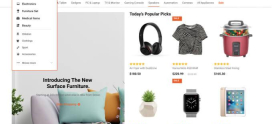
Product page design
Product pages do the persuading. This is where a shopper decides to buy, so the design must answer every question and remove every doubt.
- High-quality images from multiple angles, with zoom, and where relevant, video or lifestyle shots.
- Clear, prominent pricing with no hidden surprises.
- A prominent add-to-cart button that stands out and stays reachable.
- Concise, scannable product descriptions that lead with benefits and follow with specifications.
- Customer reviews and ratings placed where they reinforce confidence.
- Shipping, returns, and availability information visible without hunting.
Category and collection page design
Category pages help shoppers browse and narrow choices. The design priority here is scannability and control.
- A clean, consistent product grid that is easy to scan.
- Filtering and sorting (price, size, rating, popularity) so shoppers can refine quickly.
- Clear, legible product cards with image, name, price, and rating.
- Enough information to compare without leaving the page.
Cart and checkout design
The cart and checkout close the sale. The single design goal here is minimal friction.
- A clear cart summary the shopper can review and edit.
- Guest checkout so buyers are not forced to create an account.
- A visible progress indicator so shoppers know how many steps remain.
- Trust signals at the point of payment: security badges, accepted payment methods, and a clear return policy.
- The fewest possible form fields, with smart defaults and autofill support.
Design priorities by page type
| Page type | Primary job | Key design elements | Best practices |
|---|---|---|---|
| Homepage | Orient and route | Value prop, featured products, navigation | Clear paths, trust signals, fast above-the-fold load |
| Category | Help browse and narrow | Product grid, filters, sorting | Scannable cards, fast filtering, consistent layout |
| Product | Persuade and convince | Images, price, add-to-cart, reviews | High-quality visuals, prominent CTA, scannable copy |
| Cart | Confirm intent | Editable summary, totals, continue button | Transparent costs, easy edits, clear next step |
| Checkout | Close the sale | Minimal form, progress bar, trust badges | Guest checkout, fewest fields, reassurance at payment |
Why do trust elements matter so much?
Online shoppers cannot touch the product or look the seller in the eye, so trust is engineered through design. Visible trust elements reduce the hesitation that kills conversions.
- Security and SSL signals: a padlock, HTTPS, and recognizable payment badges reassure shoppers their data is safe.
- Reviews and social proof: genuine ratings and testimonials show that real customers bought and were satisfied.
- Clear policies: easy-to-find shipping, returns, and privacy information removes uncertainty.
- Reachable contact information: a visible way to reach a human signals a legitimate business.
Trust is not a single badge in the footer. It is a consistent thread woven through the homepage, product pages, and especially the checkout.
How do you design for mobile commerce?
Mobile shoppers are often distracted, on slower connections, and working with limited screen space. Mobile commerce design must respect all three.
- Thumb-friendly touch targets with comfortable spacing between tappable elements.
- Legible typography that needs no zooming.
- Simplified navigation such as a clear menu and persistent search.
- Streamlined mobile checkout with autofill, digital wallets, and as few fields as possible.
- Fast-loading, appropriately sized images so pages render quickly on cellular networks.
A store that is merely “responsive” is not necessarily designed for mobile. Test the actual mobile experience the way a customer would use it, on a real phone, on a real connection.
Is accessibility part of eCommerce design?
Yes, and treating accessibility as core design rather than a compliance checkbox widens your audience and improves usability for everyone.
- Sufficient color contrast so text and buttons are readable.
- Descriptive alt text on product images.
- Full keyboard navigability through menus, forms, and checkout.
- Clear focus states and properly labeled form fields.
- Logical structure that works with screen readers.
Accessible design is rarely at odds with good design. Clear contrast, legible text, and well-labeled controls help every shopper, not only those using assistive technology.
Why is performance a design constraint?
Speed is part of the user experience. A store can be beautifully designed and still fail if it loads slowly, because shoppers abandon pages that make them wait. Performance is a design feature, and it should be planned alongside layout and visuals, not patched in afterward.
- Optimize and correctly size images, the single largest weight on most store pages.
- Minimize render-blocking scripts and heavy third-party widgets.
- Prioritize above-the-fold content so the first screen appears fast.
- Choose hosting built for eCommerce performance so the underlying delivery is fast and reliable.
Design and speed work together. A clean, well-structured page that loads quickly converts better than a richer page that stalls. Treat every design decision as also a performance decision.
Build your well-designed store on hosting that keeps it fast
Great design only converts if your store actually loads fast for every visitor. DarazHost eCommerce hosting is built for exactly this: SSD storage, LiteSpeed server technology, and an integrated CDN so your carefully designed pages render quickly worldwide. Speed and design convert together, and slow hosting undermines even the best design work.
Every plan includes free SSL for the security and trust signals a store needs at checkout, backed by 99.9% uptime so your store stays available when shoppers are ready to buy, and 24/7 expert support whenever you need help. Design your store to convert, then host it where it can actually perform.
How do you reduce checkout abandonment through design?
Checkout abandonment is largely a design problem, and it is the most profitable problem to fix because these shoppers already wanted to buy.
- Offer guest checkout. Forced account creation is a leading cause of abandonment.
- Cut every unnecessary field. Ask only for what is required to complete the order.
- Show a progress indicator so shoppers know how close they are to done.
- Be transparent about costs early. Surprise shipping or fees at the final step drive abandonment.
- Reinforce trust at payment with security badges, accepted methods, and a visible return policy.
- Support autofill and digital wallets to make completion effortless, especially on mobile.
Treat the checkout as the most important design surface in your store, because in revenue terms, it is.
Frequently asked questions
What is the most important element of eCommerce design?
There is no single element, but if you must prioritize one, prioritize the checkout. It is where committed buyers convert or abandon, so reducing its friction recovers more revenue per unit of design effort than any other page. After that, focus on trust signals and page speed, both of which influence conversion across the entire store.
How does eCommerce design affect conversion rates?
Design shapes how easily and confidently a shopper can complete a purchase. Clear hierarchy guides attention to products and calls to action, trust elements reduce hesitation, mobile-first layouts serve the majority of traffic, and fast performance prevents abandonment. Each is a lever on conversion, and they compound when applied together.
Should I design my store mobile-first?
Yes. A large and growing share of store traffic is on phones, and mobile-first design forces you to prioritize the essentials. A layout that works well on a small screen almost always scales up cleanly, whereas a desktop-first design often breaks down or frustrates when squeezed onto mobile.
How does hosting affect eCommerce design and conversions?
Hosting determines how fast your designed pages actually load for real shoppers. Even a well-designed store converts poorly if pages stall, so fast hosting with SSD storage, LiteSpeed, and a CDN is part of delivering good design. Hosting also provides the SSL that powers the security and trust signals shoppers expect at checkout.
How is store design different from store navigation?
Design is the broader discipline covering layout, visuals, hierarchy, trust, performance, and the look and feel of every page. Navigation is one component of that design, specifically how shoppers move and find products. Navigation is critical, but it sits inside the larger design system. See our dedicated guide for navigation depth.